


You’re wanting to start a business selling your skin care products. One of the first things most businesses need, besides the name, is a logo. In this post I will give an overview of how to design a business logo.
Logos are important, they provide a visual representation of your business name and usually include some sort of symbol that implies what your business is, and it ends up being put on everything associated with your business as your first steps of establishing your brand. Most small businesses, when they get started can’t necessarily afford a designer, and might have to resort to DIY and I’m here to help whether you are designing it yourself, or having somebody else do it.
If you can afford it, you can absolutely go to Fiverr and hire somebody affordably there, but even then, you might want to have an idea of what you want in mind so you can give them some sort of guidance such as supplying references of fonts/assets/other logos. By doing so, they can get a general idea of what you are wanting the vibe of your logo to be. Even a sketch of a font or symbol will help them out greatly as well as providing a write-up about your company, a mission statement or other pertinent information. Designers aren’t mind readers and will appreciate any and all information you can provide.
If you are planning on hiring, because let’s face it, not everybody has the time or know how to DIY their logo, feel free to skip down past the software and more technical information in the beginning part of this blog.
This isn’t going to be a complete tutorial on how to actually create a logo. That’s a hugely involved ordeal and there are already plenty of resources online to help you navigate that part of the process, but rather this will be an overview of the process and some basic things to keep in mind.
Also, a logo can evolve, so don’t stress out thinking the first version that you end up using is what you will be stuck with for the life of your business. You can absolutely change it later.
Raster vs. Vector Graphics
So here’s a quick explanation of the differences between Raster and Vector Graphics, and why I HIGHLY recommend creating your logo in Vector and/or making sure whoever is designing it for you is providing the logo in a Vector format.
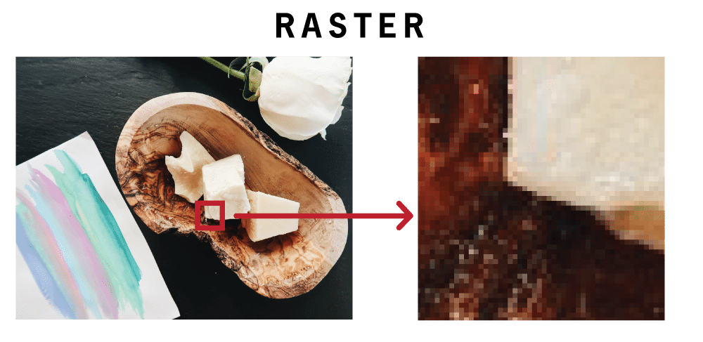
Raster: Raster graphics are created with pixels/dots only. They are limited in quality by the original size they are created at. Best example is a photo. If you take a photo and zoom in on it, you will reach a point where you see the pixels. When you artificially enlarge the image to a higher resolution, the software you are using will just try its best to guess at what the pixels in between those original pixels look like, and since it’s not magic, there’s no way to sharply and realistically add those pixels, inevitably, it will be blurry. You can’t add information easily that wasn’t there to begin with. With rasterized images and graphics, you are limited with how large they can be printed or displayed and file sizes tend to increase depending on the resolution (and compression) of the image/file.
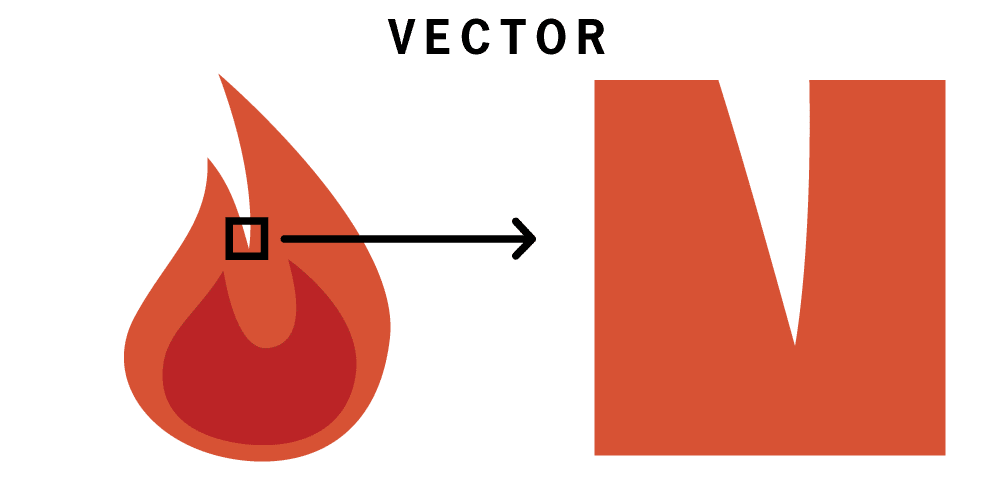
Vector: Vector graphics, simply put, are created with math. They utilize points, shapes, colors, and gradients represented with mathematical values to create graphics that will scale to any size that you need. You can zoom in on them for infinity, and they will never be fuzzy or pixellated. An added plus to using math to display graphics means the file size is kept down as well since all of the pixel information isn’t stored in the file. This is the preferred graphic type to use to create your logo, that way you will never have an issue getting your logo displayed on packaging, flyers, business cards, videos, billboards, as it can literally be any size you need it without any loss of quality.
The Software
If you’re planning on designing a business logo yourself, you’re going to need an app to design it in. The industry standard software to use is the Adobe Creative Cloud. Which includes Illustrator, the vector-based app that I would typically recommend to use. Unfortunately, unless you are a full time designer, or qualify for a discount as teacher or a student, the Adobe Creative Cloud subscription isn’t always something that makes sense for most people to pay for and the learning curve can be pretty steep. So I’ve put together a list of alternative software/apps (in no particular order) that are either completely free or way more affordable.
Note: Canva is not on this list because it is purely a raster program and while useful and popular for quick designs, I don’t recommend it for logo design.
InkScape: Completely free and open source, Inkscape, while not having the complete arsenal of tools available in Adobe Illustrator, InkScape has pretty much everything you could need to make your logo. It works on Windows, Mac and even Linux and they provide tutorials on how to use the software here.
OS/Platform: Windows, Mac OS, & Linux
Vectr: Completely free app, that is online/browser-based, so as long as you have access to a web browser, you can use this. It even has guided tutorials to get you started.
OS/Platform: Any Web Browser
Boxy SVG: This is another free app, also online so web browser access is all that is needed. They don’t have guided tutorials, but do supply tutorials on how to do basic things here.
OS/Platform: Any Web Browser
Vectornator Pro: This is available on iOS/iPad and is a fully fleshed out tool set and is completely free and frequently updated.
OS/Platform: iOS
Affinity Designer: Affinity Designer works on Windows, Mac OS and iPad and is a very powerful toolset with a bit of a learning curve. It handles both vector and raster graphics and offers a free trial. Full price it’s $50 for Mac OS/Windows versions and $20 for iPad, but it’s not a subscription so once you buy it, you own it. I would recommend this for anybody who thinks they’ll continue to do their own design work and willing to put the time and effort in to learn the software as it’s become one of the best alternatives to Illustrator out there. They provide basic tutorials as well: https://affinity.serif.com/en-us/learn/
OS/Platform: Windows, Mac OS, & iPad
Fonts/Text
One of the first steps for starting your business logo design, tends to be figuring out the font/lettering for the logo. There are three main types of modern day fonts, you have Sans Serif, Serif and Script.
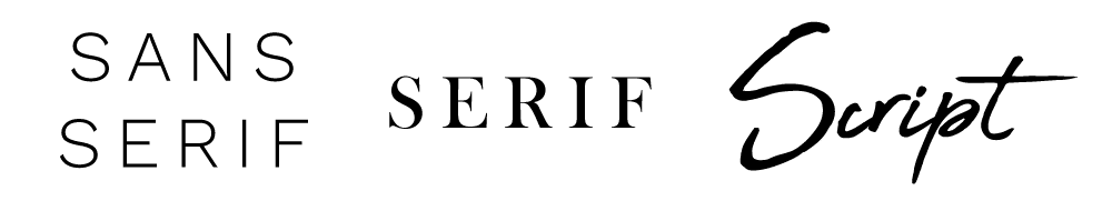
Depending on the feel of your company, you’ll want to pick something appropriate, just make sure that it’s very legible. You need it to be quickly decipherable, especially with Script fonts, as they can look beautiful and elegant, but you need to make sure they can be read at even smaller sizes.
If you’re DIY-ing your logo, a good resource for fonts is DaFont. The fonts are organized and filterable, and you can preview your business name in all of the fonts easily. One note is a majority of the fonts are free for personal use and not necessarily for commercial use. So since we’re talking about a business logo, you will want to make sure that the free font that you are choosing is “100% Free” or “Public Domain.”
Another option is Google Fonts which also allows you to preview the text and, as a bonus, every font is open source and completely free. Another perk of these fonts is when you get around to creating a website, they can be easily imported into your website to keep your branding consistent.
For a paid option, a really great resource is Creative Market. This website curates designers and assets, allows them to set the prices for licenses on their products, which includes fonts, website themes, general graphics, stock photos and more. You can find some really unique and high-end looking fonts here and directly support creators.
Lastly, if you’re one of those talented people at hand lettering, absolutely do that. Create your own font/lettering to really make your logo unique!
Icon/Symbol
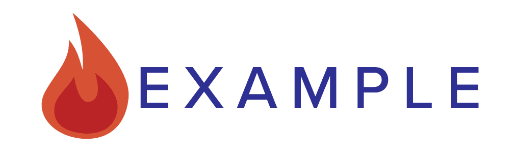
For the more graphic part of the logo, the symbol isn’t always necessary, but it’s a very common and effective way to get across the idea of your business alongside your actual business name, and when needed, to provide an abbreviated version of your full logo when the full version isn’t necessary or feasible.
Typically when I’m designing a logo for a client, the end result is 2-3 different versions of the same logo so there is flexibility in displaying the logo based on where it’s being displayed and which layout is most appropriate:
Horizontal Orientation  Vertical Orientation

Abbreviated Version
For the colors of the symbol itself, I try to keep the color count low and simple. Gradients can absolutely be used, just keep in mind that you might need to print/display your logo in a single color, such as black or white at some point in the future, so make sure the design as a whole would still be understandable in a single color alone.
As for the colors, you’ll want to max out the color palette at 5-6 colors for your entire brand, although I typically stay closer to 3-4. You’ll probably want 1-2 neutral colors and then the rest being any colors you want (keeping in mind printability limitations) as long as they work well with each other. Don’t feel like you have to use pure black/pure white in your logo either. Pure black can look too harsh/stark, so aim for a dark grey instead, same for pure white, try a light grey.
A good resource for quickly looking at color palette options is: https://coolors.co/ You can see user submitted palettes or create your own, locking in colors you like, generating new random colors, and save palettes. Plus, they provide the exact hex values for the colors that you can either send off to your designer or plug into your design software of choice.
As for the shape of the symbol, make sure your lines in your design aren’t too thin because you don’t want them to almost disappear at smaller sizes. Choose a shape that represents your business and/or business name, but it doesn’t necessarily have to be super obvious. You can even use the initials of your business name, or work in one of the letters into the design.
File Types
Vector: When your designer delivers your final files, or when you’re needing to export the logos you’ve designed yourself, the vector file types you’ll want are:
EPS: Readable by most software, print shop appropriate
SVG: Scalable Vector Graphic, perfect for display on websites, readable by most software and web browsers
AI: Adobe Illustrator format, readable by a lot of software but not all
Raster: Now you will also want some rasterized versions (resolution depending on your need, but the higher the better) and do not let your designer send you a logo in only these formats.
Raster filetypes are:
JPEG/JPG: Standard image format, no transparent background
PNG: Transparent background which means you can easily drop it in on top of a colored background and won’t have an unprofessional looking white box around/behind your logo. I recommend having your logo readily available in this format for ease of use purposes.
Technical Note: If you are sending your vector files to anybody for print purposes, you will want to make sure that the font portion of the file has been outlined (converted to shapes/paths) because if you leave the font as a font/editable text, they might not have the font installed and your font will be replaced by one they do have, which will not be what you want.
This post ended up being really long and somewhat technical, and congrats if you’ve read through the entire thing. I realized I couldn’t cover everything that is really needed. Hopefully you’ve gleaned enough from this to help you figure out how to design a business logo, either designing your own or discussing the design of your logo with a potential designer, whether it’s through Fiverr or through somebody else.
If you have any questions or need any clarifications, feel free to leave a comment and I’ll try and help the best I can!